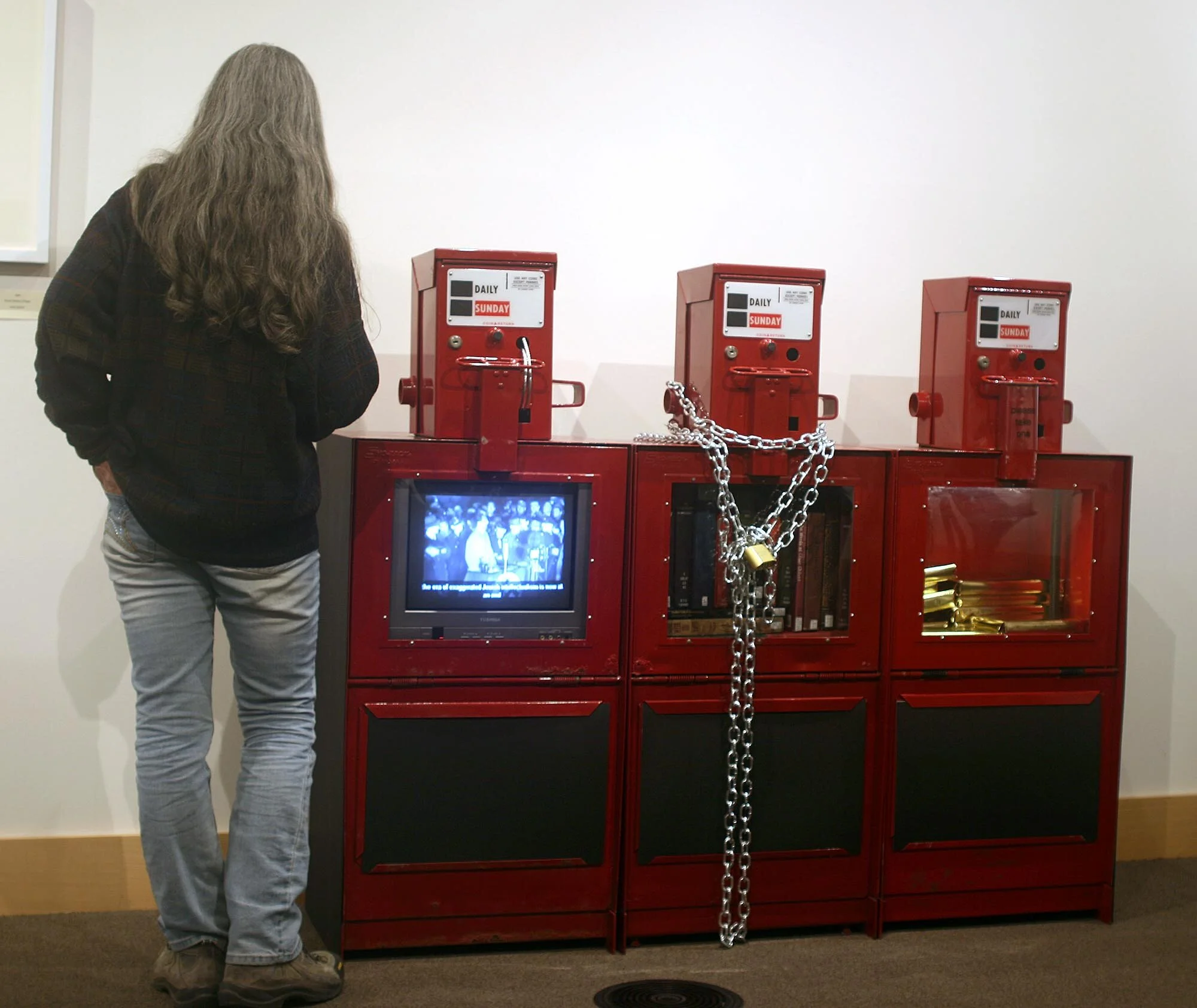
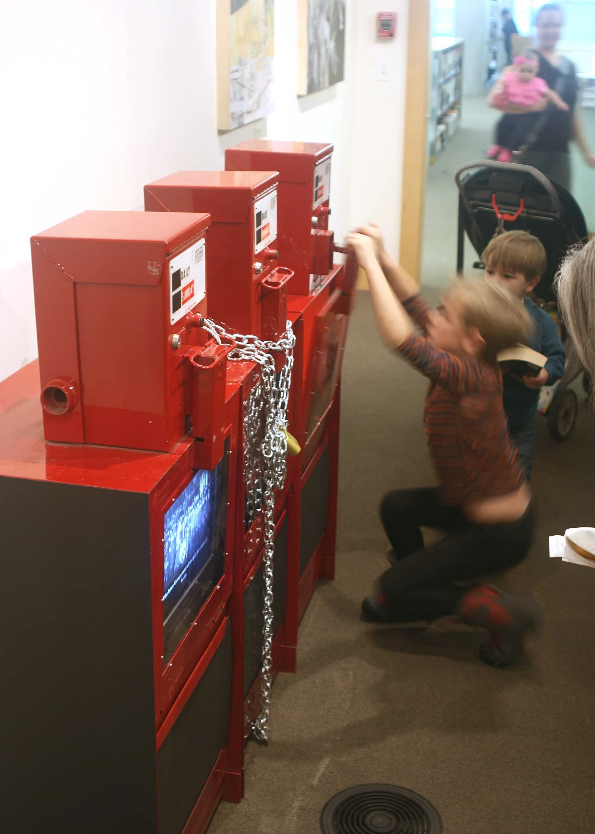
Don't Read This
Don't Read This encouraged viewers to consider the visual and aesthetic aspects of language, through preempting the ability to read that which was written.
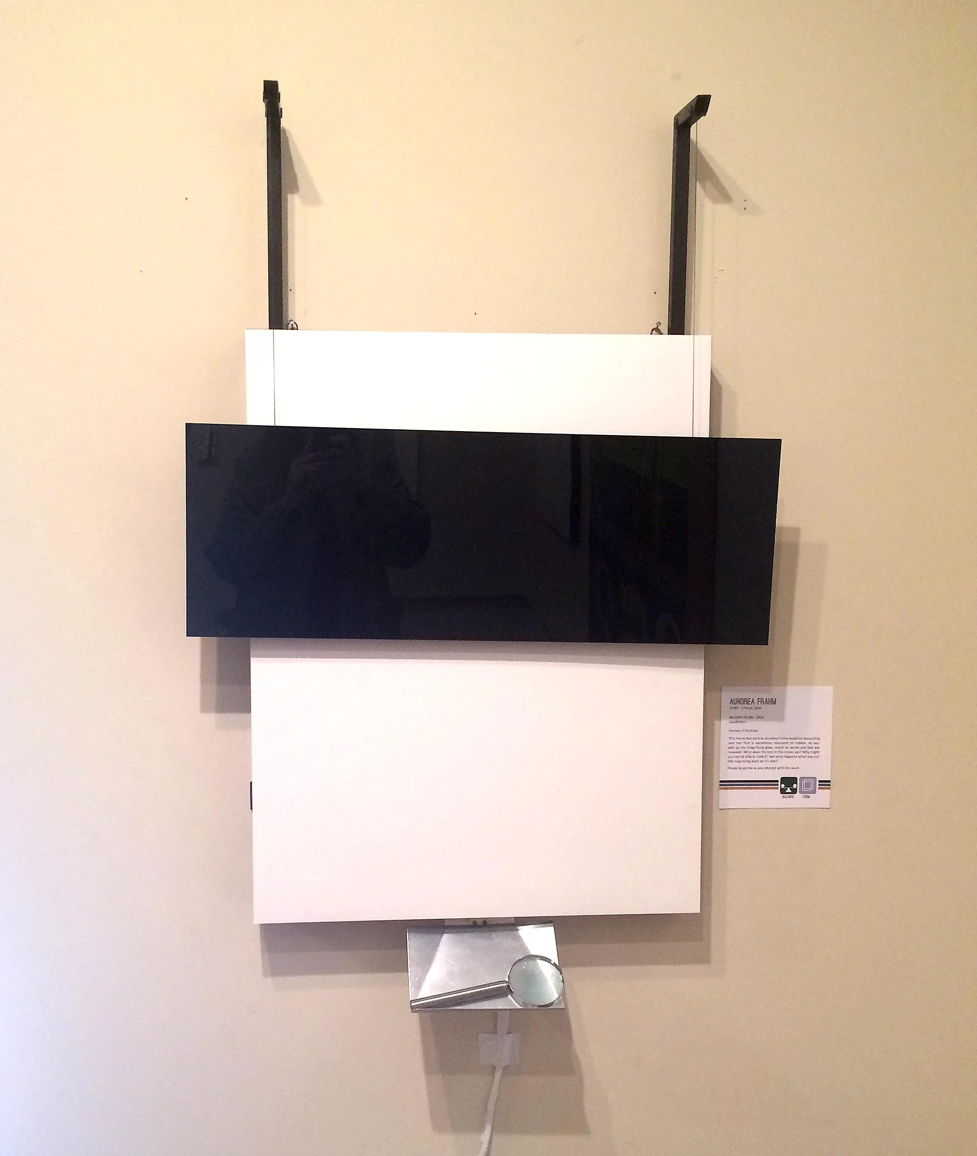
My work in Don’t Read This, installed at the main branch of the Salt Lake Library, 2015
Don’t Read This
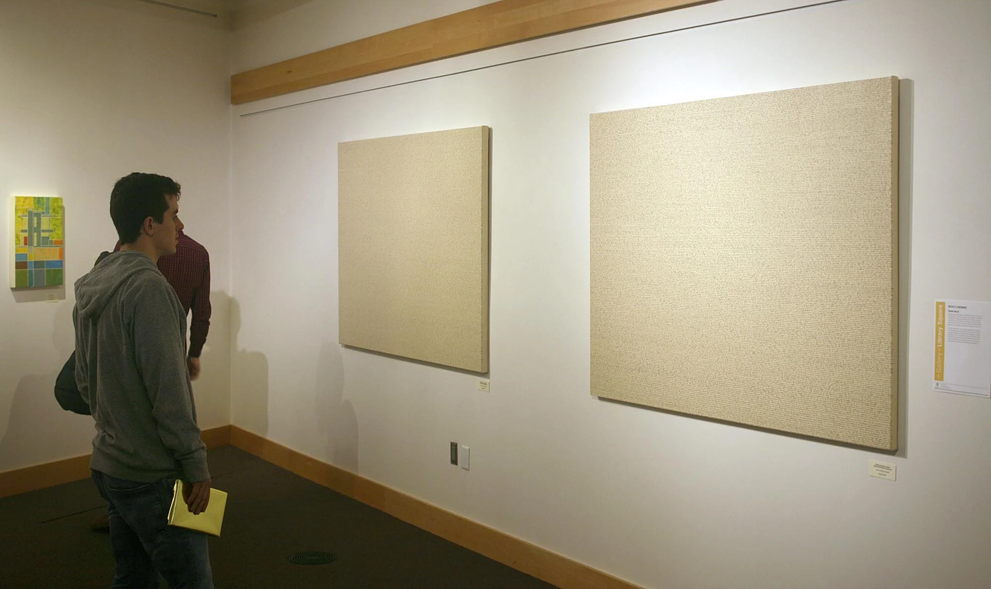
“It is a long established fact that a reader will be distracted by the readable content of a page when looking at its layout.”
Thus begins lipsum.com's explanation for the widespread use of "lorem ipsum," the standard dummy text of the typesetting world. The same is true for visual art that involves text. Viewers often get lost reading the text instead of considering the artwork’s aesthetic aspects. Text has value for its formal as well as its communicative qualities. The beauty of language finds expression not only in the communicated content, but in the symbols we use to represent language visually.
Don't Read This encouraged viewers to consider the visual and aesthetic aspects of language, through preempting (to a greater or lesser extent) the ability to read that which was written.
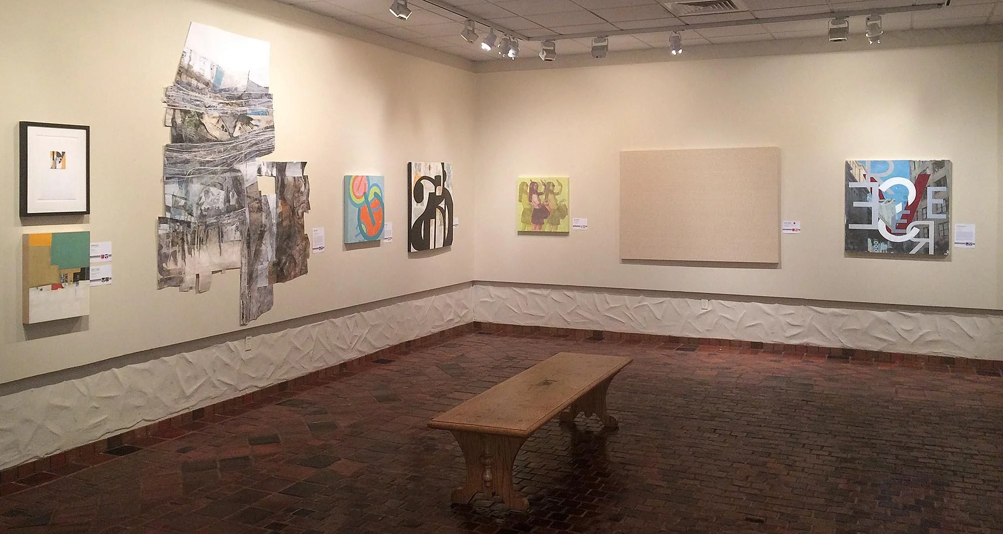
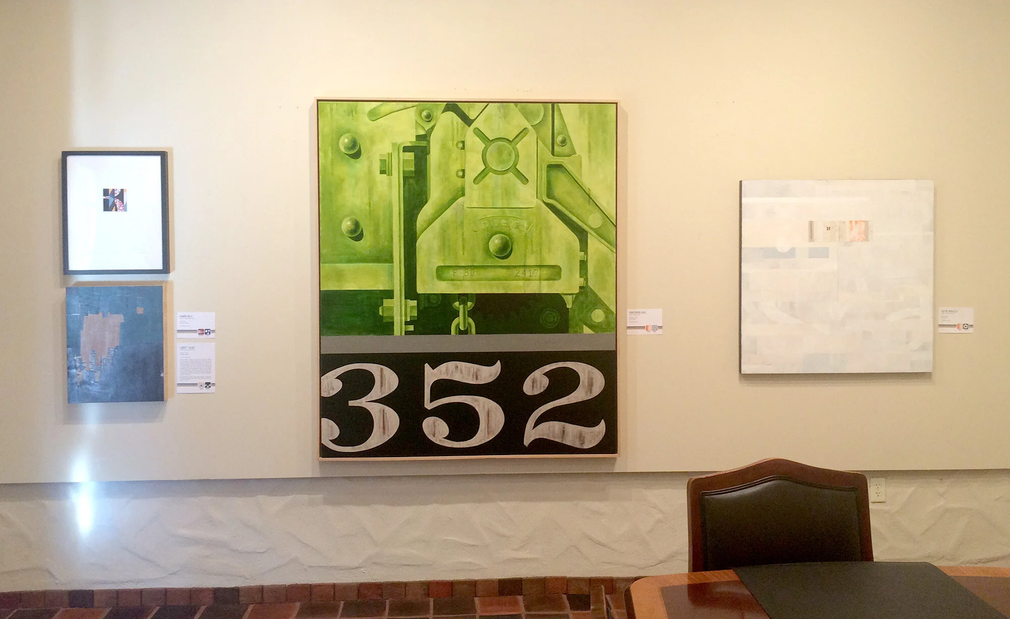
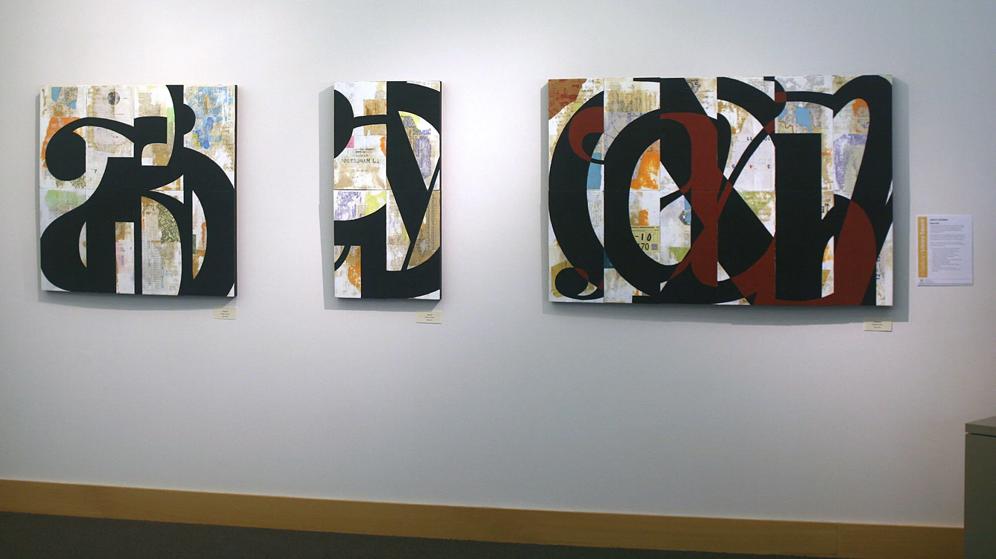
Don’t Read This involved 8 artists and showed in the downtown Salt Lake City Library in 2015.
My Work
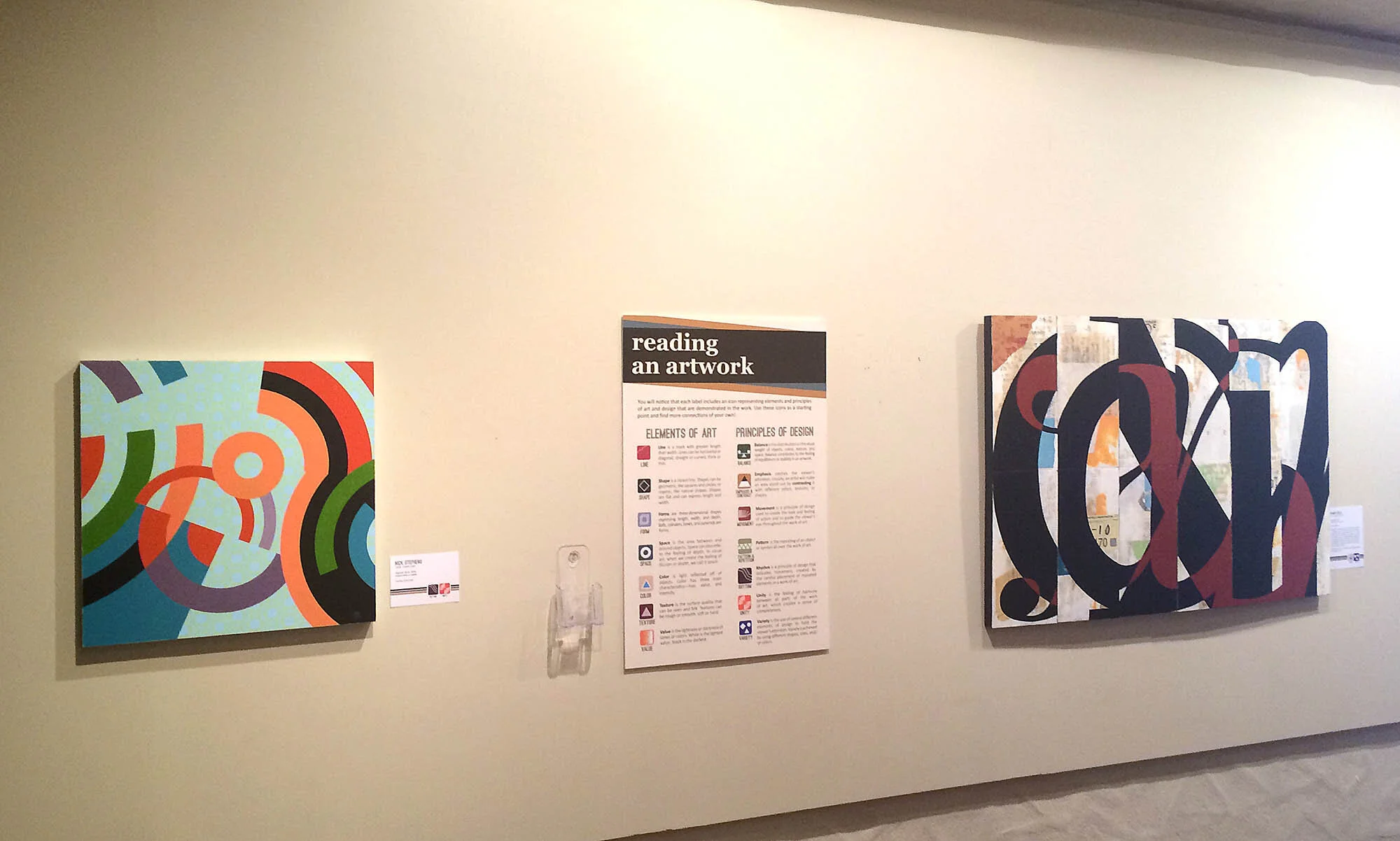
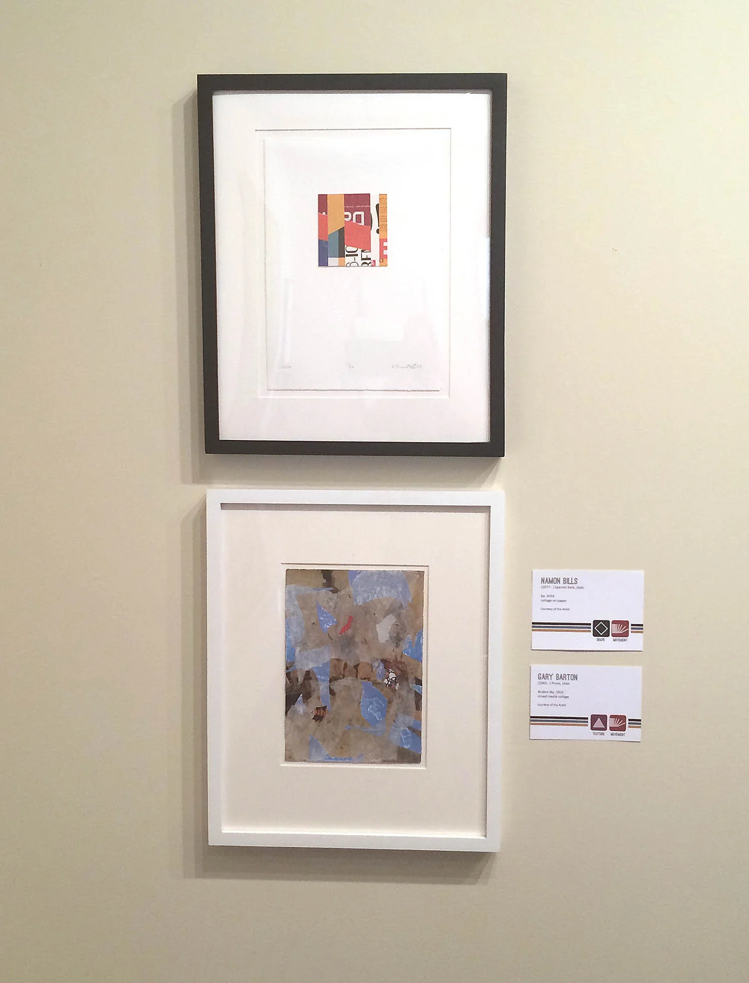
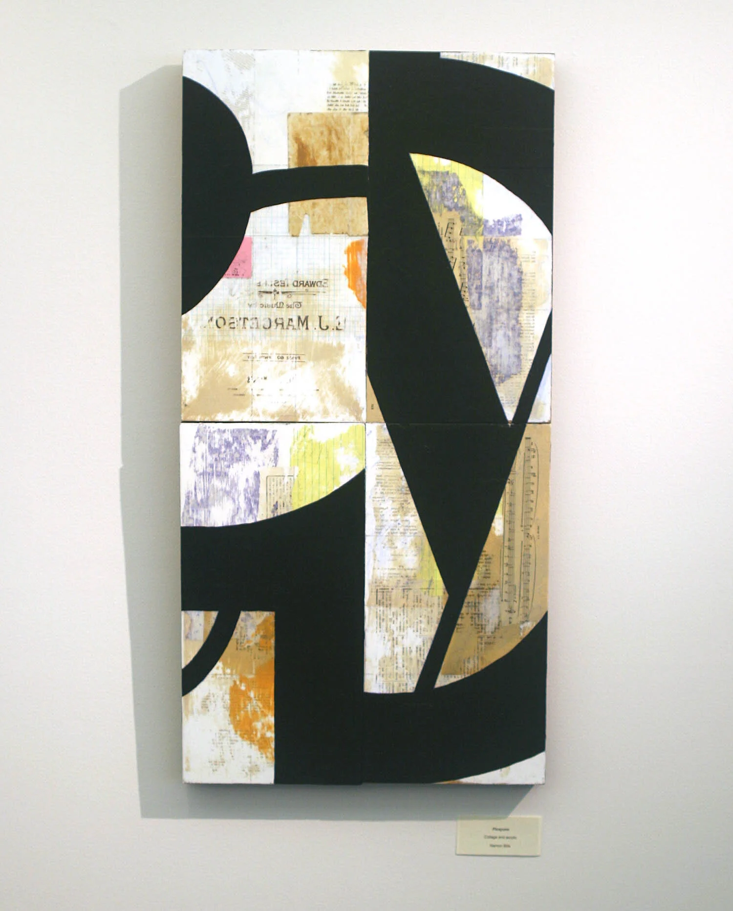
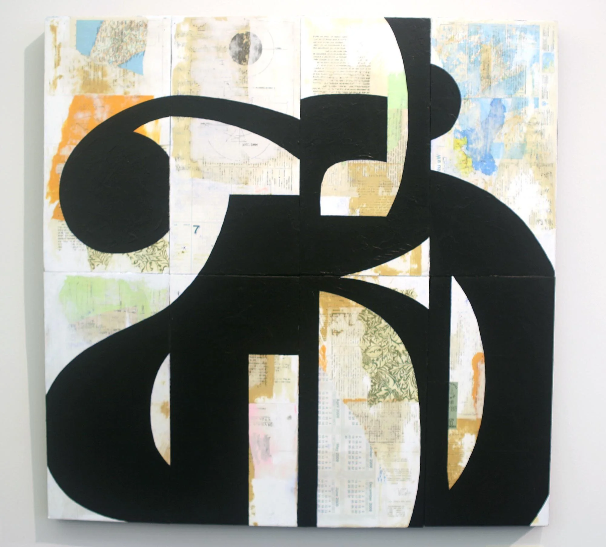
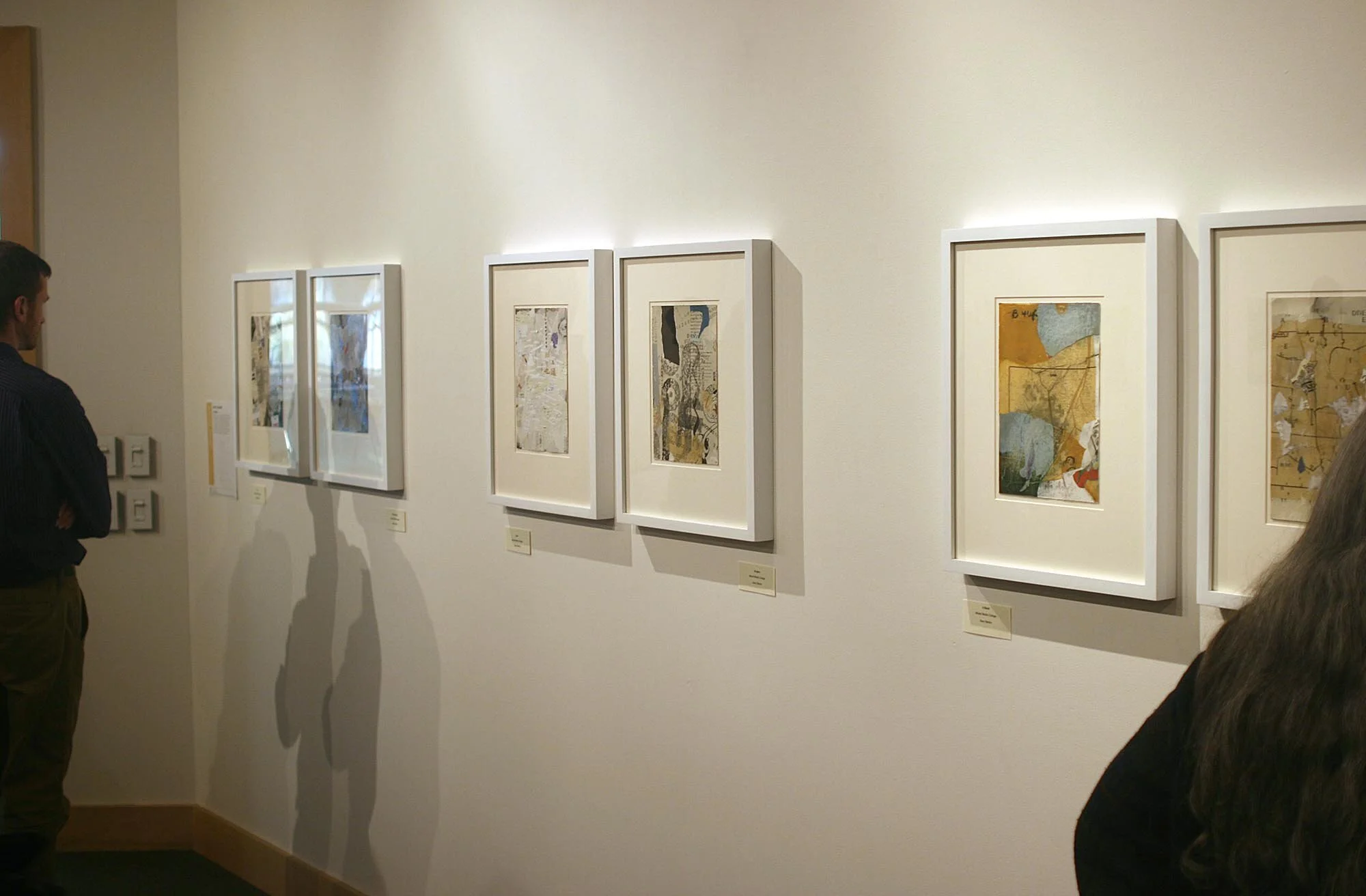
I did two sets of work for this show: small collages, and large mixed media panels. The two approaches afforded different challenges in handling text as artwork. This work also demonstrates my affinity for graphic design.


salt lake library installation
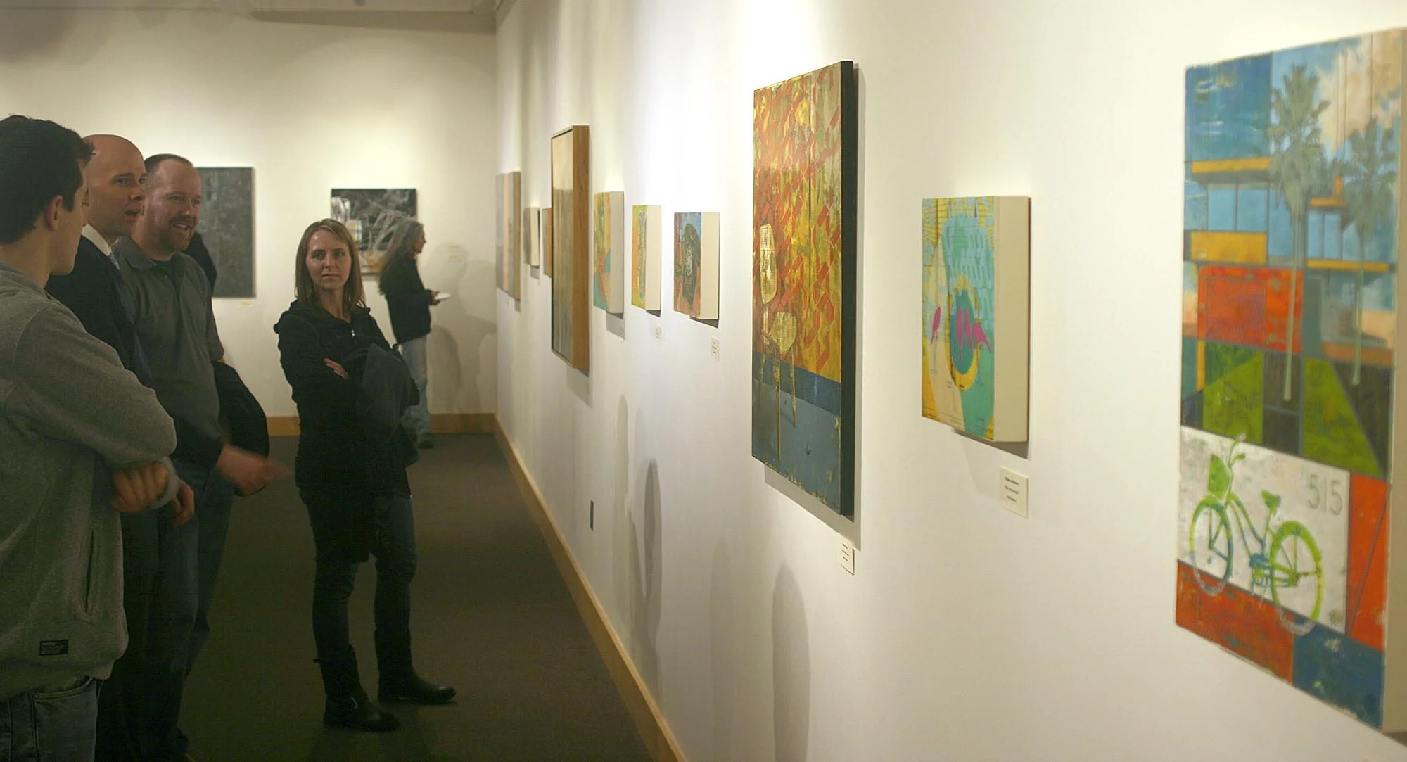

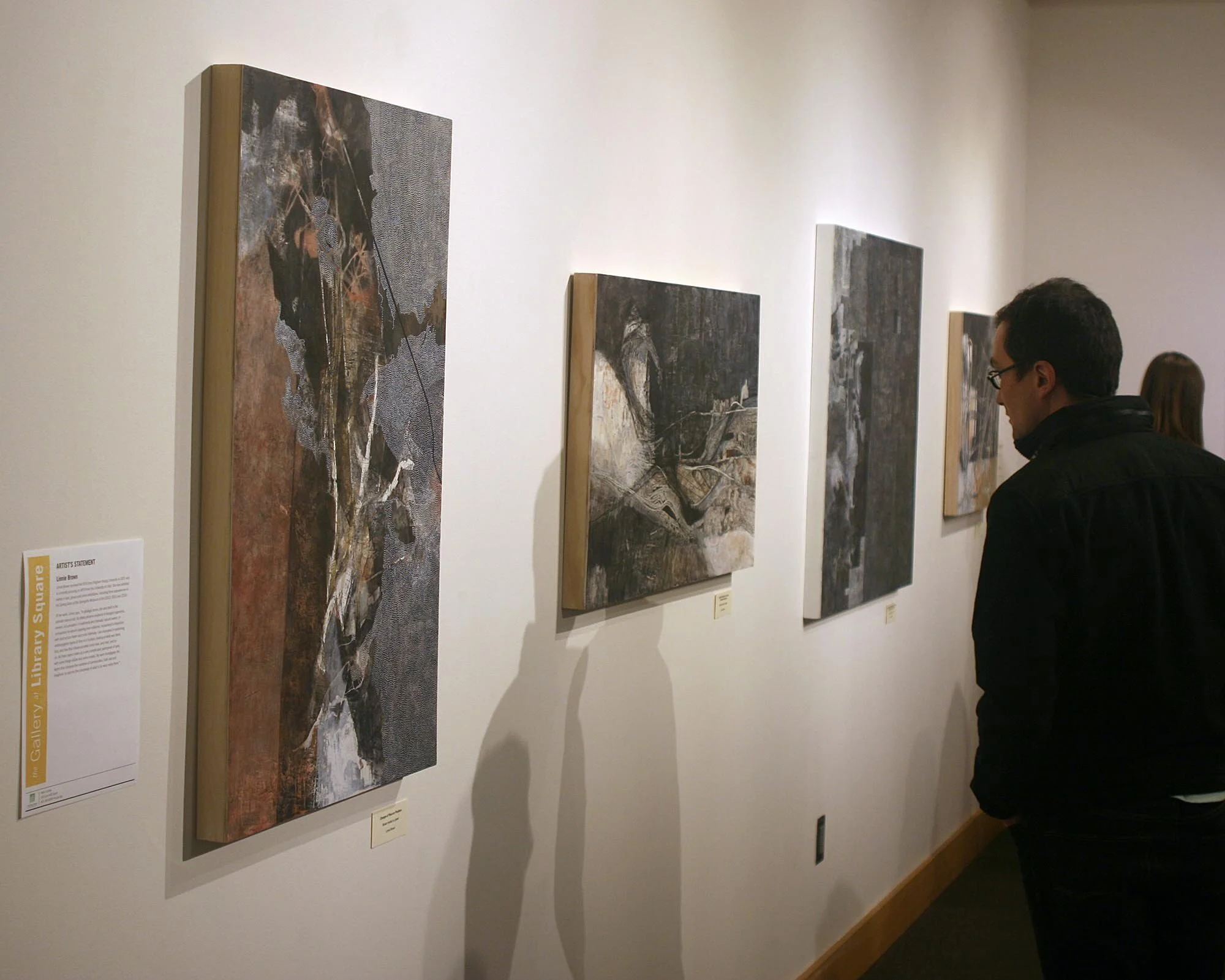
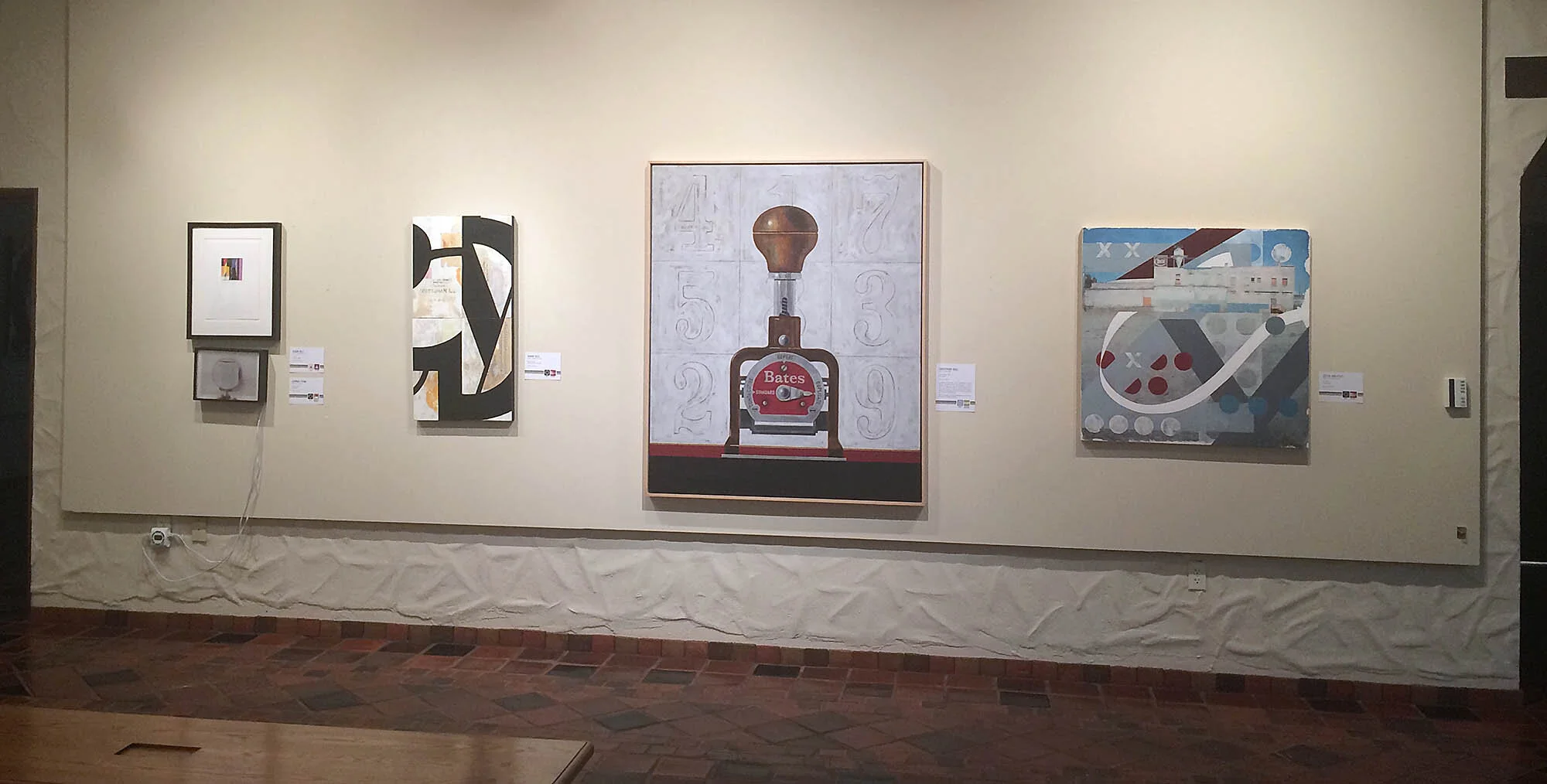
Springville Museum of Art Installation
In 2016, Don’t Read This Too showed in the Springville Museum of Art, and included some new work, and two additional artists.